Video Quality Metrics Explained: What PSNR and SSIM Miss About Watermark Removal
Last updated: September 2026
Someone sent me an export last month with a simple question: the quality report says SSIM 0.98, so why does the patched corner still look wrong to me? It is a fair question, and it exposes the gap this article is about. Video quality metrics were built to compare compressed streams against originals. Watermark removal is a different job — the system deletes pixels and invents replacements — and the metrics that flatter a video encoder can quietly mislead you about a repair.
I build watermark removal tooling at UnMark since early 2024, and quality scoring is half of my day job: every model swap, every mask tweak, every regression run gets a number attached to it. So I have developed a working feel for where each metric is honest and where it lies. The streaming world has plenty of explainers on these numbers, almost always written from the compression side. This is the other side: the four video quality metrics PSNR, SSIM, LPIPS, and FVD — what each actually measures, the specific way each one fails on inpainted footage, and what I check instead before an export ships.
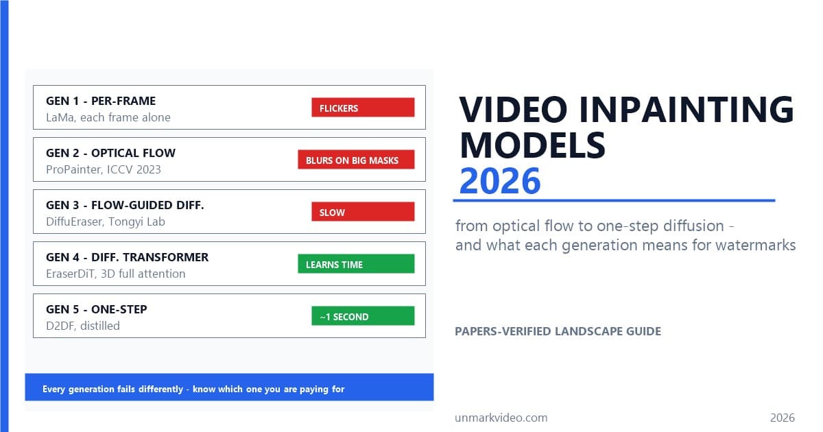
If you want the model-side story first, the five-generation inpainting walkthrough covers how the reconstruction itself evolved. This piece stays on one axis: how do you know whether the result is actually good?
What Do the Video Quality Metrics PSNR and SSIM Actually Measure?
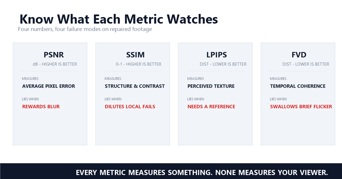
PSNR compares two frames pixel by pixel and reports the average error in dB. SSIM compares luminance, contrast, and structure instead, and reports 0 to 1. Both need a reference frame, and both judge how closely your output matches the original — not how good it looks.
PSNR descends from mean squared error, the oldest trick in signal processing: subtract the two images, square the differences, average them, wrap the result in a logarithm so it reads in decibels. Higher is better, and bigger numbers mean smaller pixel errors. It is cheap, deterministic, and everywhere — which is exactly why our industry's vendor benchmarks lean on it. Volcano Engine's DiT subtitle-erasure write-up, which I examined in the inpainting model overview, reports an overall PSNR above 38 on its benchmark set. That number tells you their reconstruction stays close to the source pixels. It does not tell you the patches look right, and the authors know it.
SSIM arrived in 2004 to fix exactly that blind spot. Zhou Wang and his co-authors published it in IEEE Transactions on Image Processing (vol. 13, no. 4, pp. 600-612), and the idea was to score luminance, contrast, and structure separately — the things your visual system actually tracks — then combine them into a single 0-to-1 index. The SSIM project page hosts a demonstration that made the whole case for me: six distorted images, all carrying roughly the same MSE, yet visibly different in quality. As the authors put it, "all distorted images have roughly the same mean squared error (MSE) values with respect to the original image, but very different quality" — Zhou Wang, The SSIM Index for Image Quality Assessment. Same pixel error, different pictures. SSIM separates them; MSE cannot.
That was a genuine step forward, and SSIM deserves its reputation. But notice what it still is: a comparison against a reference. Everything it knows about your footage comes from the pixels that were supposed to be there. Which raises the awkward question for repair work.
Why Can a High Score Still Look Bad?
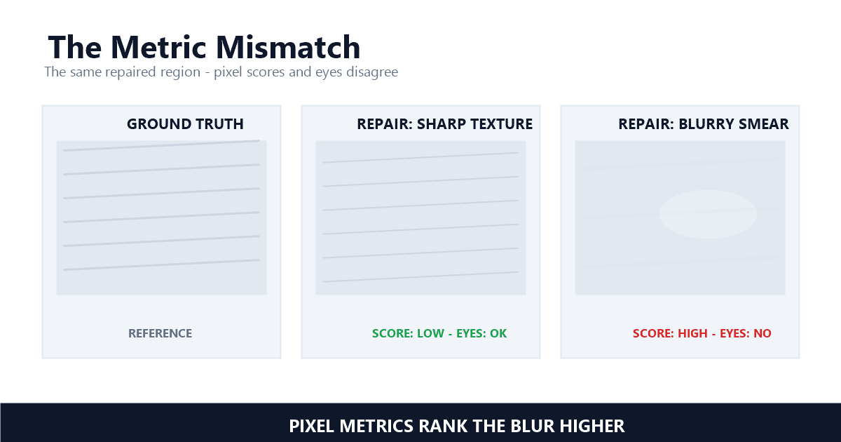
Inpainting is a generation task, but PSNR and SSIM are alignment metrics. When a model invents a plausible texture that differs from the original, the metrics score the difference as error. A blurry patch that averages toward the background often scores higher than a sharp, believable one.
Here is the mechanism. The pixels behind a removed watermark never existed in your output — the model manufactured them. If it manufactures something sharp and textured that differs slightly from the original blade of grass, PSNR logs every mismatched pixel as error. If it instead produces a soft smear that lands halfway between the surrounding colors, the pixel errors shrink and the score climbs. The metrics reward the smear. Your eye does exactly the opposite: it forgives a confident, plausible texture and flags blur instantly, because blur in the middle of an otherwise crisp frame is not a natural state of footage.
The perceptual-metrics community has been saying this out loud for years. The LPIPS paper opens its abstract on the problem: "the most widely used perceptual metrics today, such as PSNR and SSIM, are simple, shallow functions, and fail to account for many nuances of human perception" — Richard Zhang, The Unreasonable Effectiveness of Deep Features as a Perceptual Metric. Wang and Bovik devoted an entire IEEE Signal Processing Magazine essay to the same verdict on MSE and its descendants (vol. 26, no. 1, Jan. 2009), titled — I am not making this up — "Mean squared error: love it or leave it?"
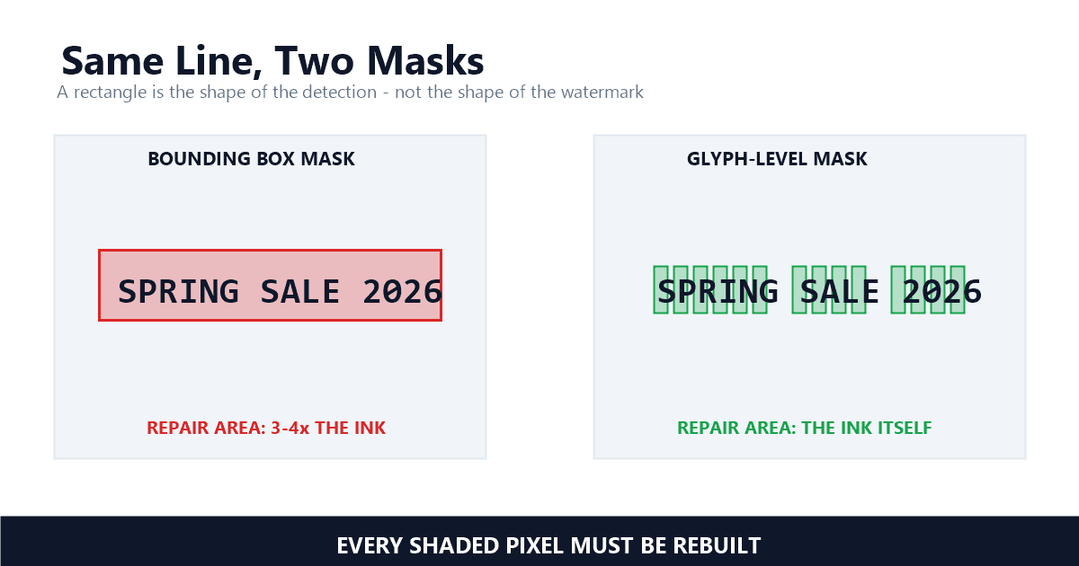
For watermark removal there is a second twist that the compression literature never had to deal with: scale. A codec distributes small errors across the whole frame. A remover concentrates everything it did into maybe 2% of the frame — the mark's footprint, tightly masked, as I covered in the repair-area piece. Frame-wide averages then dilute the one region you actually care about. A 0.98 SSIM can coexist with a visibly wrong patch, because the other 98% of the frame is untouched original footage carrying the average. The number is true and useless at the same time.
What Does LPIPS See That PSNR Cannot?
LPIPS measures perceptual similarity using features from deep networks trained on images, and lower is better — a direction flip that trips people up. The CVPR 2018 paper behind it found deep features beat classic metrics by large margins at predicting what humans actually judge as similar.
The idea sounds almost lazy until you see it work: instead of hand-designing what "structural" means, push both images through a network that learned vision from millions of examples, and compare the activations. Those intermediate features encode texture, edges, even object parts the way human judgment seems to. When Zhang and his co-authors at Adobe and UC Berkeley built a dataset of human similarity judgments and ran the horse race, the result was blunt: "deep features outperform all previous metrics by large margins on our dataset" — Richard Zhang, The Unreasonable Effectiveness of Deep Features as a Perceptual Metric. The deeper surprise in the same paper is that this holds across architectures and training regimes — supervised, self-supervised, even unsupervised. Perceptual similarity, they argue, is an emergent property of learned visual representations.
In practice LPIPS is the metric that catches what my earlier examples described. A smeared patch scores worse under LPIPS than a sharp, plausible one, because the deep features register "this texture is fake" the way your eye does. That alignment with human judgment is why we run it as the tiebreaker when two candidate reconstructions tie on pixel scores. In our analysis, it separated the blurry candidate from the sharp one more reliably than any pixel score did.
Two caveats keep me honest about it. First, direction: LPIPS is a distance, so lower is better — 0.05 beats 0.15 — and I have watched people skim a report and congratulate a model for getting worse. Second, it still wants a reference. It ranks candidate repairs against each other beautifully; it cannot look at a raw export with no original and tell you anything. For that problem, you need the video-level metric.
Why Does FVD Rate Videos Instead of Frames?
FVD scores whole video distributions instead of single frames, built because researchers lacked metrics that consider visual quality, temporal coherence, and diversity. It finally put time into the score. But as an average over thousands of frames, it can swallow a three-frame flicker entirely.
Every metric so far judges stills. Footage is not a stack of stills — it is motion — and the researchers building video generation models felt that gap. The FVD paper states the motivation directly: "current progress is hampered by (1) the lack of qualitative metrics that consider visual quality, temporal coherence, and diversity of samples" — Thomas Unterthiner, Towards Accurate Generative Models of Video. Their answer, Fréchet Video Distance, borrows an idea from generative-model evaluation: embed whole clips with a trained video network, model each set of clips as a distribution, and measure the distance between distributions. A human study in the same paper confirmed FVD tracks how people rate generated video.
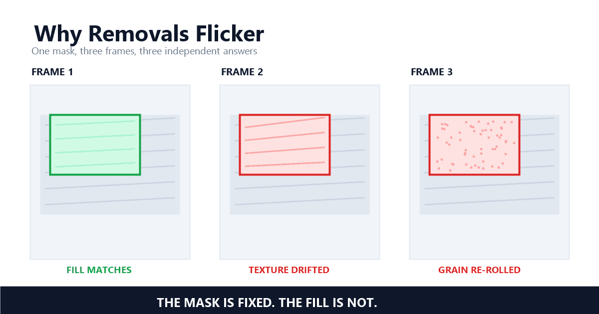
Why does a watermark removal blog care about a generative-modeling metric? Because temporal coherence — the thing FVD was invented to capture — is precisely the failure mode of naive per-frame repair, which I dissected in the flicker deep dive. A remover that reinvents the same patch independently on every frame produces texture that boils and strobes. FVD's emphasis on temporal coherence is the field admitting that frame-level scores were missing half the picture.
But here is where FVD earns its place in the "know the failure mode" hall of fame for creators: distribution averages hide local disasters. Picture a 10-second clip at 30 fps — 300 frames — where the patch behind a moving logo flickers badly for 3 of them. Averaged across the clip, or across a 1,000-clip evaluation set, those 3 frames are a rounding error. FVD will report a healthy number. Your viewer, who cannot unsee a strobe, will report a different verdict. FVD is brilliant for ranking research systems and nearly useless for judging your individual export — which is why nobody should ship video based on any single-number average, and why the check that matters happens in your player, not in a script.
Which Metric Should You Trust Before You Export?
None of these metrics run in your editor, and you do not need them to. In my testing, the check that holds up is three looks: zoom to 200% on the repaired patch for texture, play 3 seconds at quarter speed for flicker, and re-inspect the mask edge for ghost outlines.
Each look maps to one of the metrics, which is the quiet reason this article was worth writing: you can run the metrics with your eyes once you know what they watch. The 200% zoom on the repaired patch is your LPIPS proxy — you are checking whether the fill reads as believable texture or as smear, which is exactly the perceptual judgment the deep features approximate. The 3 seconds at quarter speed is your FVD proxy — temporal coherence, watched directly instead of averaged into oblivion. The mask-edge pass is your SSIM proxy — structure continuity across the boundary where repair meets original, the exact seam where a ghost outline lives. I described the mask-side version of this in the 30-second mask check; on the quality side the same habit applies to the fill itself.
Three honest notes from running this at scale. Compression interacts with everything: a patch that looks soft before export can sharpen or smear further once your encoder mauls the 1080p file, so always check on the export, never the working file. Busy backgrounds — foliage, fabric, crowds — are where both invention and flicker concentrate, so bias your attention there; the product video guide shows where that bites in practice. And if the fill survives all three looks but strobes in final playback, run the full 60-second flicker test — the quick check triages, the full test confirms.
How Do We Score Quality in Our Own Pipeline?
Inside our pipeline the metrics run offline against a fixed regression set: PSNR and SSIM where clean ground truth exists, LPIPS as the perceptual tiebreaker. No score ships an export by itself — a human pass on the marked regions is the final gate, every time.
The regression set is a fixed batch of reference clips that we measured before every model swap since mid-2024 — synthetic cases where we control the original pixels, so PSNR and SSIM mean something, plus real-world footage scored with LPIPS where no ground truth exists. Model candidates that win on pixel scores but lose on LPIPS get rejected, because that pattern is the blurry-smear signature from earlier in this article. Detection feeds this too: a mask placed 2 px off poisons every downstream number, which is why the detection and segmentation stage gets audited separately from reconstruction.
The vendor benchmarks sit in the same hierarchy. Volcano Engine reports PSNR above 38, and I treat that as a meaningful floor for a production DiT system — vendor-reported, like I flagged in the overview, but consistent with what the two-stage training recipe should deliver. What I never do is let a benchmark number answer a question it was never asked. "Close to the source pixels" and "looks right to a person" overlap often and diverge exactly when it matters: on invented texture, at mask edges, in motion.
That hierarchy — metrics as dashboards, eyes as judge — is the whole philosophy. If you want to see the pipeline these numbers supervise end to end, the detection-to-reconstruction walkthrough shows the full journey. And if you would rather never think about any of this, that is what UnMark is for — the quality gates run so you do not have to.
References
- Z. Wang, A. C. Bovik, H. R. Sheikh, E. P. Simoncelli — "Image quality assessment: From error visibility to structural similarity," IEEE Transactions on Image Processing, vol. 13, no. 4, pp. 600-612, Apr. 2004 (The SSIM Index project page, University of Waterloo)
- Richard Zhang, Phillip Isola, Alexei A. Efros, Eli Shechtman, Oliver Wang — "The Unreasonable Effectiveness of Deep Features as a Perceptual Metric" (LPIPS), CVPR 2018, arXiv 1801.03924v2
- Thomas Unterthiner, Sjoerd van Steenkiste, Karol Kurach, Raphael Marinier, Marcin Michalski, Sylvain Gelly — "Towards Accurate Generative Models of Video: A New Metric & Challenges" (FVD), arXiv 1812.01717v2
- Z. Wang, A. C. Bovik — "Mean squared error: love it or leave it? A new look at signal fidelity measures," IEEE Signal Processing Magazine, vol. 26, no. 1, pp. 98-117, Jan. 2009
Last updated: September 2026